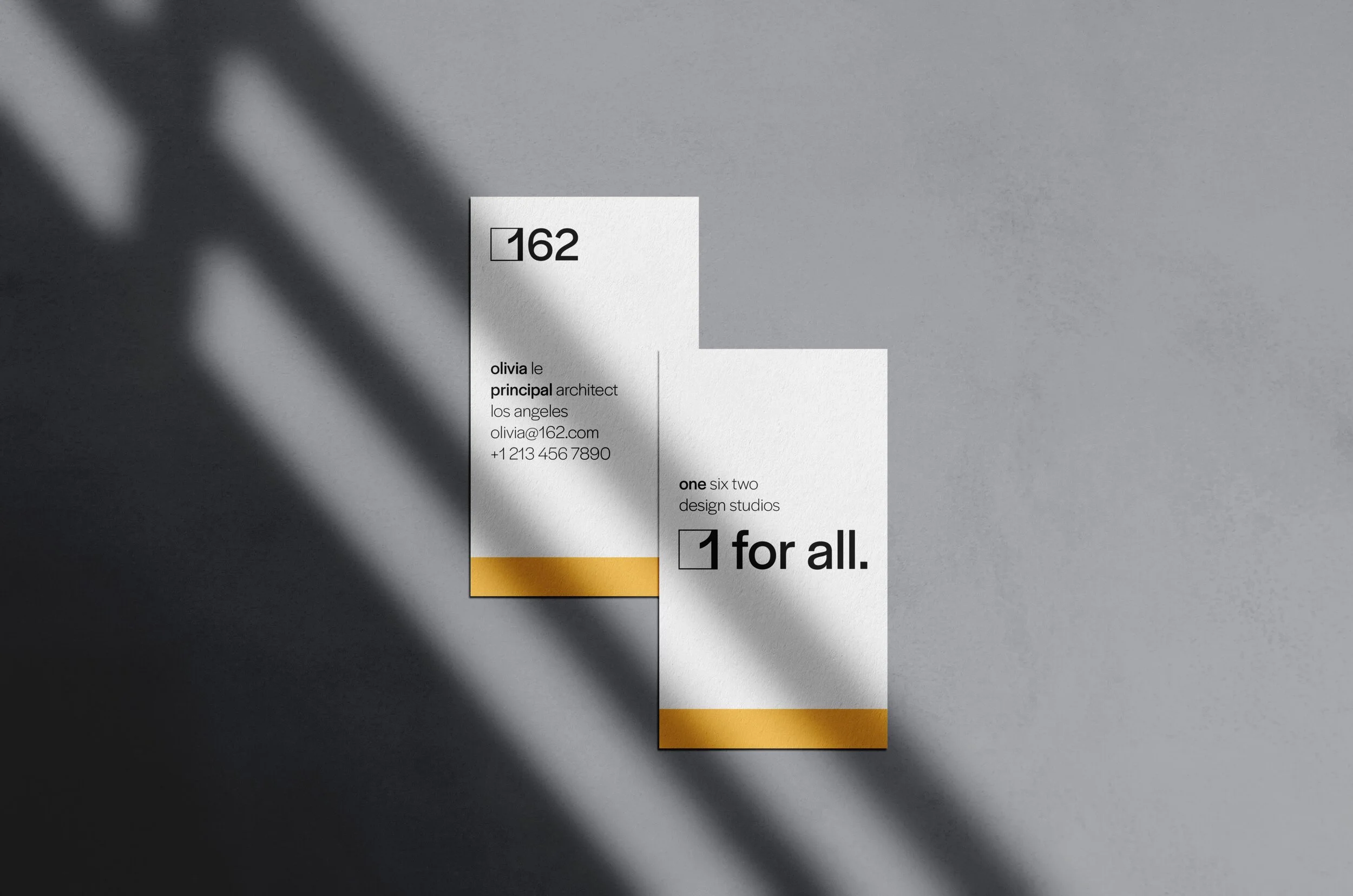
162 Studio
An architecture studio for an inclusive future.
162 Design Studios is an architecture firm concept that invites change and actively looks to welcome all. Architecture is often made with exclusion in mind. It’s seen in public works that are made to be unwelcoming to people experiencing homelessness, and it’s seen in the inspirations and design cues in public & private works alike. It’s even seen in the firms themselves. We thought it’d be appropriate to design what an alternative looks like. Hence, 162’s brand is centered around inclusion. The name “162” was chosen for two reasons: (1) numbers are universal and (2) the golden ratio—1.6180…—is used in design globally. Arabic numerals are nearly ubiquitous, and the name is translatable in any language.
The challenge in designing this brand was in creating something that felt inviting while still having a personality of its own. To achieve, the brand was designed with warmer colors, room to breathe, an emphasis on welcoming language, and a modern feel to emphasize the forward-looking nature of the brand.
Logo Design
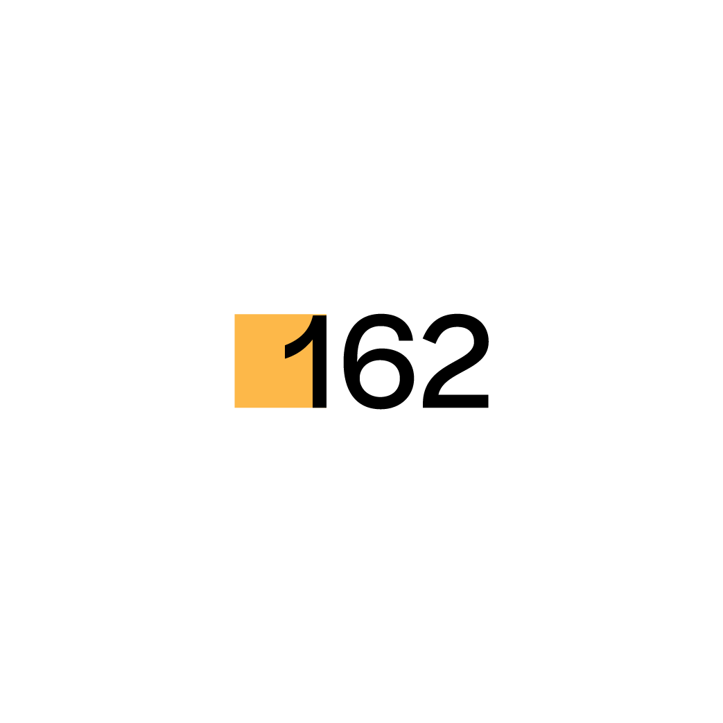
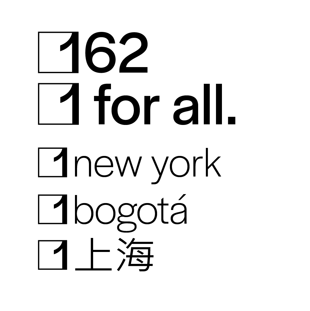
“What does inclusion look like?” is behind each decision for this brand. The typeface for the logo needed to be both distinctive and readable, so we chose “Halyard”, a typeface with several subfamilies for visibility at different sizes. While maintaining legibility, Halyard also has distinctive characteristics that make it memorable and modern all at once. Meanwhile, the golden color was chosen as a nudge to the golden ratio and as a color that is bright, calm, and happy. Again, the brand’s goal is inclusion, and fostering a light-hearted brand is necessary to this. The square is chosen as a literal building block of the brand—all margins are based on multiples of the square. In addition, it’s used to signify cities where projects would be, and it’s used as part of the motto’s design. It is a simple-but-memorable mark that easily identifies the brand.
Brand Voice
162’s vision of inclusiveness extends to its voice in ad design and website design. This is highlighted in the motto of “1 for all”, and all verbiage stems from this theme. “All”, “everyone”, and “everybody” are used often. Projects are described in a way that is educational and easy to understand. The voice is hopeful and assertive. For example, the example library project seen above is describes the need for a truly welcoming, all-inclusive public space, and it educates readers through easy-to-understand examples. As a small detail, important nouns, such as names of places and people, are in all lowercase, as a way to emphasize a more welcoming feel. However, sentence case is used for headers and descriptions for legibility purposes.
Photography
The photography style of 162 is well-exposed photos with warm-neutral tones and moderate contrast. Images are shot with a more true-to-life feel using slightly wider focal lengths, such as 35mm. This style of photography was chosen to feel inviting. A telephoto lens would make large buildings feel small, and too wide of a wide-angle lens would render buildings in an imposing way. Photos are shot during around golden hour or overcast skies to provide calm lighting.


